ShopDreamUp AI ArtDreamUp
Deviation Actions


Description
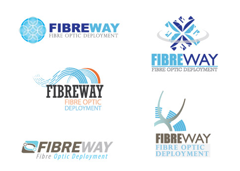
I need to present 3 options to the client, and this is what I've been working on... Please feel free to give me your thoughts & suggestions.
Image size
484x346px 55.66 KB
© 2008 - 2024 hippiedesigner
Comments7
Join the community to add your comment. Already a deviant? Log In
I think that in the purest form of simplicity the lower left design looks the best. It has a strong enough elements that will not get lost when printed at smaller sizes ie; business cards. I like the typefaces chosen and the contrast in tones. The oblique type is a little more dynamic without being to predominate.
The logo could be a bit taller in proportion to the logo type. This would provide a better sense of weight and balance. I would also align the top of the type to the top of the logo, such a minimal misalignment looks like a mistake rather than a design choice.
The logo could be a bit taller in proportion to the logo type. This would provide a better sense of weight and balance. I would also align the top of the type to the top of the logo, such a minimal misalignment looks like a mistake rather than a design choice.